A similarity matrix uses a matrix to show the similarities between two different pieces of data.The higher the score (the more similarities), the more closely together the points on the graph will fall.
A mental map is a map that a person recalls through mental though. They can be of specific objects, roads, abstract memories or any other possible form of image recall. I included this picture of Killarney, Ireland, because when I think about this area, this mental picture comes to my mind.
Bilateral graphs use both sides of a zero line to show the increase and decrease of data.This is used when the information being shown has both positive and negative numbers.
Standardized choropleth maps are used to show the distribution of certain information over a specific area.The above image shows the population per square mile by state.
Unclassified choropleth maps use shading instead of numbers to represent specific data about a geographical area.The above map shows the population of Canada under 14 years old.
A classed choropleth map uses shading or color intensity of the key to display certain information about a specific area. This map shows the percentage of population for each area of the United States.
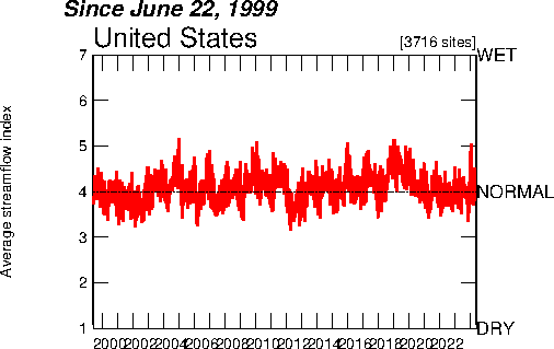
The index value plot is used to show differences between specific information by the use of frequency on a line.This image shows the average stream flow of the United States since 1999.
Population profiles are used to show information pertaining to the demographics of a certain area.This population profiles shows information about people who are without health insurance.
A windrose is a map used to show meteorologists the frequency of winds blowing from different directions for a specific area.This windrose shows the wind direction for the Fresno Air Terminal in California.
A parallel coordinate graph is used to display multivariate information, with each variable containing its own Y-Axis.Specific parts of the data alter the shape of the graph. This above graph shows different information about cells in a specific gene.
A univariate choropleth map shows information about only one topic that is specific to a region.This above map shows only the electoral votes compared to the state votes in teh 2004 Presidential election.
A bivariate choropleth map shows two different items pertaining to a specific area. This above map shows the amount of Olympic Athletes from areas in the United States, compared to the population.
A range graded proportional circle map is a map that shows the data in proportion circles, with the circles in relation to ranges of data. The information is separated as equal quantiles, breaks, natural breaks, and minimum variance.
A continuously variable proportional circle map depicts information about a specific area with circles.The circles vary in size depending on the information it is conveying.
The lorenze curve depicts the cumulative distribution function of a probability distribution on a graph. They are commonly used to depict information about income.
DEM’s are maps used to depict the elevation of a specific area, typically by use of remote sensing versus direct surveying by satellites. This actual image is part of the Czech Republic.
A DRG is simply a scanned copy of a standard topographic map. The information in the map is altered to fit the regulations necessary for the Universal Transverse Mercator projection. The above DRG is of Conestoga Gardens.
An isopleth map uses a continuous distribution to simplify the data on a map.They normally depict information that can be viewed as a third dimension (such as elevation or precipitation).
Black and white aerial photos are exactly what they are named. They are photographs of an area taken from an aerial view, which are depicted in black and white. The above aerial view is of Poland, during World War II.
An infrared aerial photo depicts the temperature of the area or object being photographed. The differences in colors depicts the differences in temperatures. The above image is an infrared aerial photo of Hurrican Andrew as it hit Florida in 1992.
Statistical maps are used to show the distribution of a factor over a specific area. The above map shows the percent of change in population over the course of 50 years in the United States.
Contour maps are used to depict the relationship between two or more areas through the use of countour lines. The above image shows the temperatures throughout the United States.
A proportional circle map shows data by using circles in comparison to the number they represent. The above proportional circle map shows the population distribution of Africa in 1990.
Dot distribution maps show different types of information through the use of dots. The higher the density of dots, the higher numerical value they are representing. The above map is of corn for grain in harvested acres in 2002.
Propaganda maps are used to sway a persons way of thought. They are used quite often during times of warfare. The above propaganda map is from a World War.
A cadastral map is used to show information about actual property in a specific area.It can show ownership, districting, and counties amongst other things. The above image shows a set of houses in a development.
A planimetric map only shows the horizontal features and aspects of what it is depicting. They use a simple X and Y coordinate system as to be easily read.
LIDAR maps are extremely useful when trying to show the elevation of a certain area.They are able to determine a geographical areas elevation with extremely high accuracy and very quickly.This specific LIDAR map shows the elevation of the Pacific Reef in the Pacific Ocean.
DOQQ maps (digital orthophoto quads) are digitalized images taken aerially, with a total resolution of one meter.There are quite a few variations for how the pictures can appear, and this DOQQ map shows a section of North Carolina by using black and white photography.
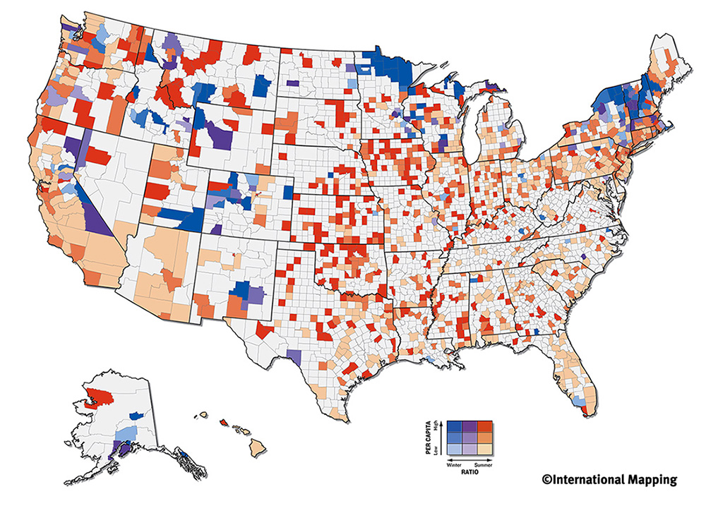
Thematic maps are named accordingly, since they are used to show a connection between a geographical area and a specific theme.They can be used to show all types of themes, such as incomes or populations.This specific thematic map displays the coal deposits of the world.
A nominal area choropleth map is used to display numerical information over a specific area. This map shows the amount of electoral votes received by each canidate of the 2000 elections.
The Doppler radar is used to show the position and speed of varying types of weather.Doppler uses changes in the sound or light waves to depict its information.This particular image is of a tornado super cell in Oklahoma.
When showing data that is multidimensional, it is best to use a star plot (also known as a spider plot because of the appearance it creates similar to a spider web).This particular star plot was used by NASA to show the best results for testing.
Box plots are used to show the variances of populations lacking any expectations of the underlying numerical divisions.The distances on the box show the level of distribution in the information.This box plot shows the amount of energy used by different machines.
Isobars are links which join together places that have the same atmospheric pressure.They are useful in the study of meteorology when using maps to try and forecast the weather.This image depicts isobars in Ireland and the United Kingdom, specifically showing the sea level pressure.
Climographs are used to show the total precipitation and temperature for a given area.Typically these maps contain three different aspects, comparing the temperature and precipitation over a specific period of time.This climograph shows the total temperature and precipitation of Honolulu, Hawaii, over the course of a year.
Flow maps are useful to show varying trends in movement, whether they be physical (such as migration), or mental (such as thoughts).This flow map shows the migration of labor in the Mekong Region.It fits the criteria for a flow map because it depicts a trend in movement (this time in migration).
Perhaps not the most conventional idea for a map, stem and leaf plots depict quantitative information in the shape of a graph.These can be extremely useful when trying to convey a large amount of numerical information.This particular stem and leaf plot depicts the ages for all family members at a family reunion.
Scatter plots are useful when trying to depict the correlation between two different things.This scatterplot is used to show the correlation between the ages of husbands and wives.
Maps which are intentionally warped in order to show a specific aspect of what they are depicting are cartograms.This particular map depicts the world in terms of gross domestic product, or how much a countries economy produces.I found this map interesting because there is such a variation between countries in levels of distortion, therefore finding there is a great variation in the different economies.


